APG Exhibits offers FREE PMS Pantone color matching! Ever wonder how manufacturers guarantee that their products always print the same color and avoid the disaster of having their logo being different shades of a color through multiple prints? The answer is the Pantone Matching System (PMS). The PMS system has been a life saver for printing trade show displays & exhibits.
This system of color matching was developed by Pantone Inc. Then part-time employee Lawrence Herbert found a way to simplify the company's pigments thanks to his knowledge of chemistry. What came out of this simplifying process was a set of pigments that have been in use in the printing industry ever since.
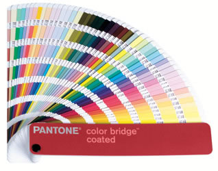
To be certain of the PMS color that you want to print with it is recommended to use a Pantone Color Guide. These guides list all of the Pantone colors available and as an added benefit show how the given color will look on different types of material (Coated, Uncoated, and Matte).
To help the sorting process of the Pantone color they are typically identified by their allocated number PMS 180C, for example, is a specific red within the Pantone system that's intended for printing on a coated material.
When designing artwork from scratch you can help the process by designing with PMS colors from the start. How can you be sure to do this? You may not have realized this, but if you're designing artwork you're likely already using software that has access to these colors. Most modern design software and creative applications come preinstalled with all the available Pantone libraries ready to go; Adobe Photoshop, Adobe Illustrator and Adobe InDesign to name a few. By utilizing these libraries paired with a physical color guide you can be certain of the accuracy of your print job and remove the worry that the logo you've spent countless hours designing will print with different shades through multiple jobs. Not only that, you should communicate with your printer regarding PMS colors. When there are critical colors that need to match closely, let them know. Don't forget to order a hard copy proof.
Always remember to order a hard copy proof to judge color, but don't count on your printer to always exactly match a Pantone color 100%. Most printers will get very close and may charge an extra fee to get closer.
NOTE: There are some PMS colors that are just out of the color spectrum that CMYK can produce, such as the florescent and more vibrant colors. In the printing industry, you are limited to what the printer is able to produce. Some of the PMS colors will not print as vibrant as the color in the PMS color books. * Colors may print differently on different substrates.
Assigning PMS/Pantone Colors to Your Artwork
Join our email list to receive monthly deals, coupons and news.